Theme: Alien
Sub Theme: Recycling centre
Overview – For this assignment we were tasked with designing a ‘Hero Asset’ to match our given themes and sub themes and to make a final video render of the asset. During this process we must also look at the making of the asset in different views and lighting and how it all came together for the final video render. We will be looking at the tools and techniques used to make our desired design as well as the thought process of it all.
ALL work was carried out with OBS on screen record on for screenshot and referencing purposes. Any other work needed or wanted to be seen can be done so on request.
Planning and Research
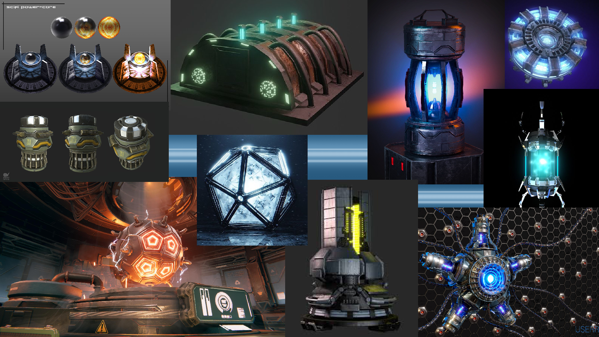
From the start I really could see myself having some fun with the chosen ‘Alien’ theme in how much potential there is to create something that has never been seen before and to really use the imagination to see what I could create. Day 1 I couldn’t get out of my head how I wanted to make some sort of power source, whether that was going to be a battery or some sort of high-tech alien technology.
As seen from the mood boards created, I instantly took that idea and try to find as many references as possible to really broaden my imagination on what I would like to create. In each of the images there is this emissive glow coming from the assets which I really wanted to try and recreate. As well as this immense emissive glow, the assets in the mood board are almost fully symmetrical with small details into the exterior design with raised faces and a very sci-fi look to them.
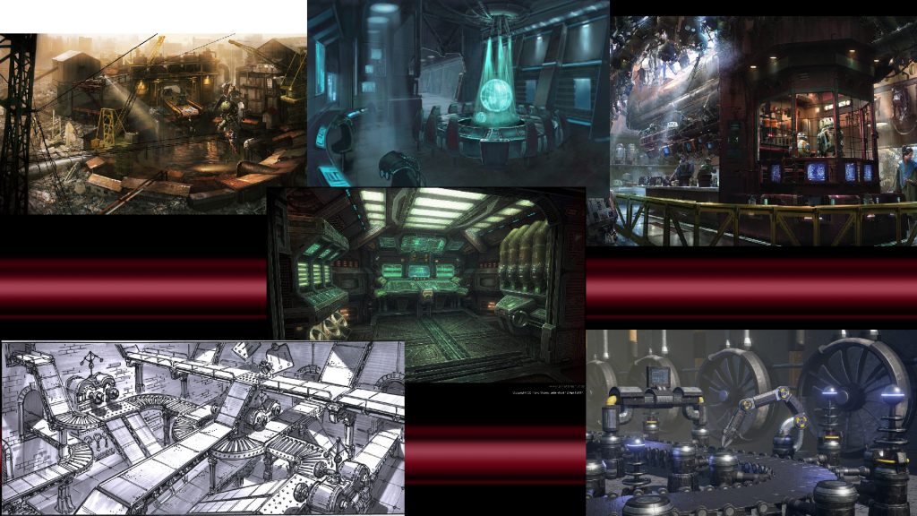
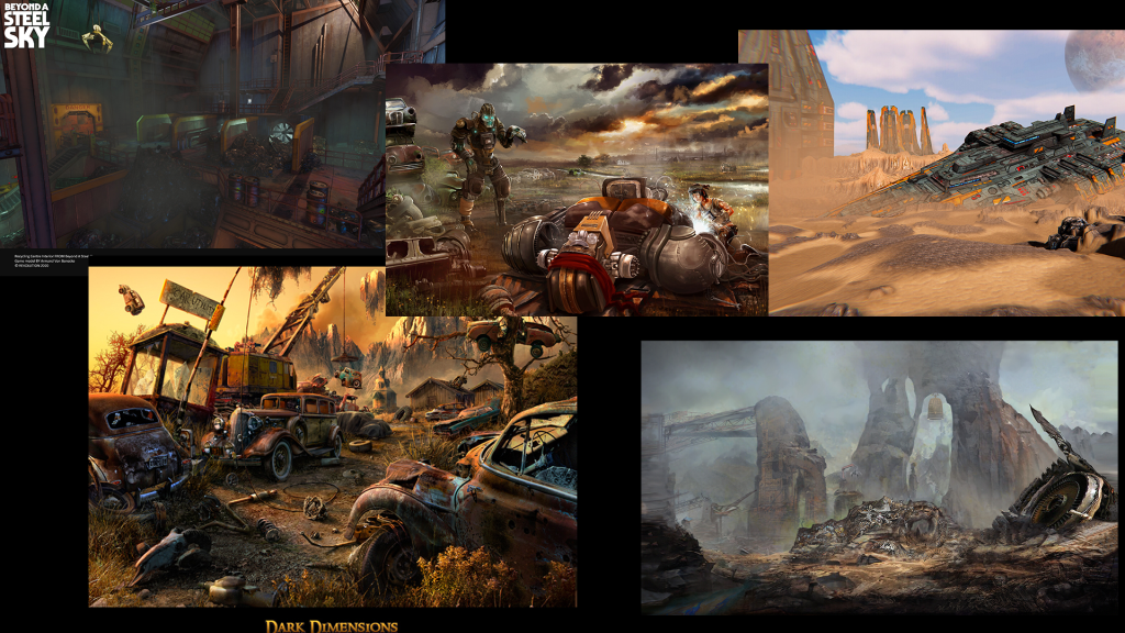
The sub-theme was a ‘Recycling Centre’ which was difficult to find ideas and references for as it’s not a very common theme in games or concept art, so I had to put a bit of thought in how I was going to portray this. Mainly the use of machinery parts and an almost industrial look is what I would be trying to aim for.
The sub-theme was the one I found more challenging into figuring out how I was going to merge the two themes together. I found that I was going to probably must use my imagination a little bit and just try to link to link the two themes as best as I could whilst maybe not being 100% accurate to the themes themselves. I can do this with a little story telling behind the scenes and hopefully that should be enough to get an idea of what I was trying to recreate.
Design exploration and rationale
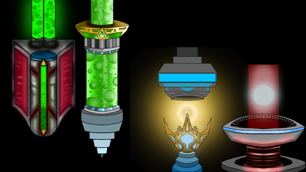
For the design element I tried to keep to my original idea of a power source and used that to create these 4 asset drawings in Photoshop. The 4 assets all contain that emissive glow I was mainly looking for as well as trying to create a sci-fi exterior look to them.
I really thought about how I was going to make the hero asset stand out in the environment and how to possibly merge this with my sub-theme. I concluded that a recycling centre will need a main source of power, and for this I chose to make as my asset an alien piece of technology at the core of the recycling centre. Therefore, making the asset really stand out when it will be placed into the environment.
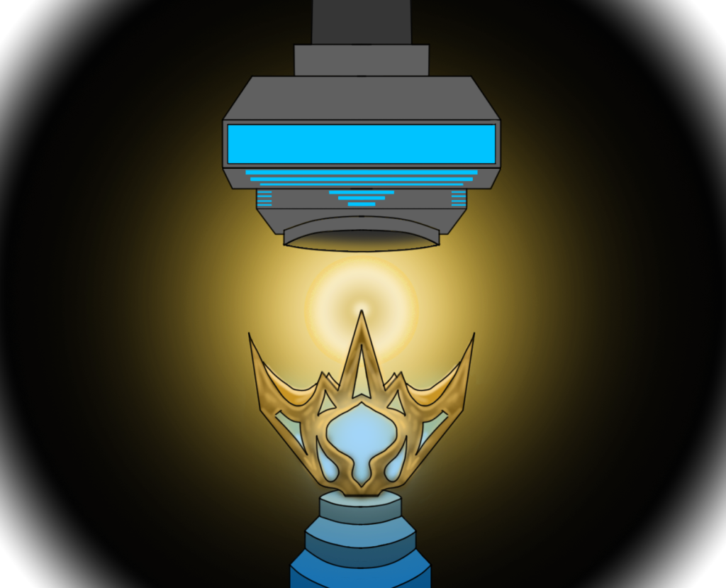
This was an idea that came to mind about a huge central core of energy between 2 components. The bottom component being the container of this huge glowing ball of energy, whilst the top was to be able to control/maintain the immense power this energy source created. Although I liked the design I thought it would be tough to merge with the sub-theme because I thought it looked to nice to be in a recycling centre.
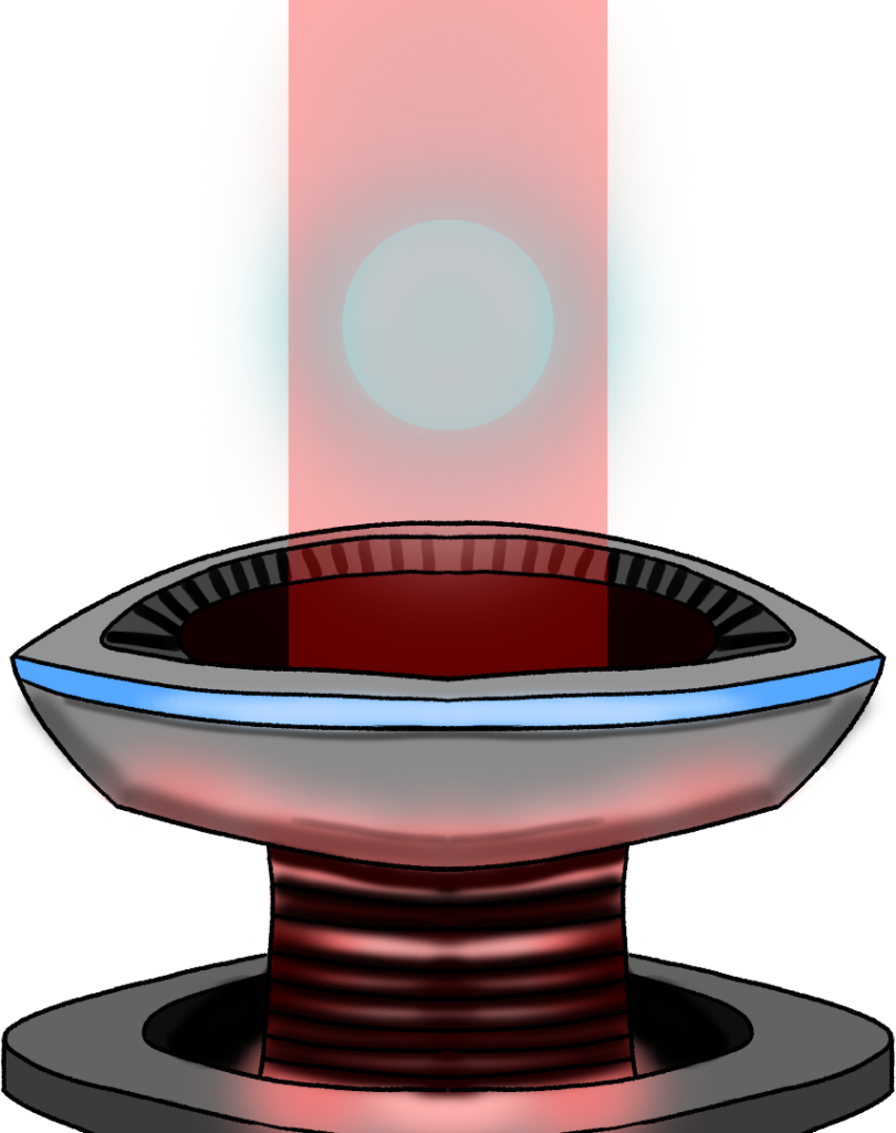
The next piece of concept art followed a very similar idea in which I made the main container of the energy on the bottom with a main power core being contained within a red beam kind of like a force field. In the end I thought it may be a bit too complex to make emissive glows within emissive glows.

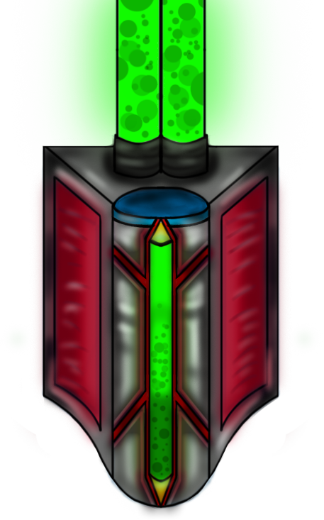
I really liked this design and made the poly model in Maya for it. I thought of the green pipe at the top connecting into the walls of the recycling centre with a green liquid inside containing moving bubbles. There is blue emissive glow coming from the top and bottom of the glass as well as the green toxic like glow from the liquid. In the end it was just a little too complicated for me to pull this off and I had to give another design a go.
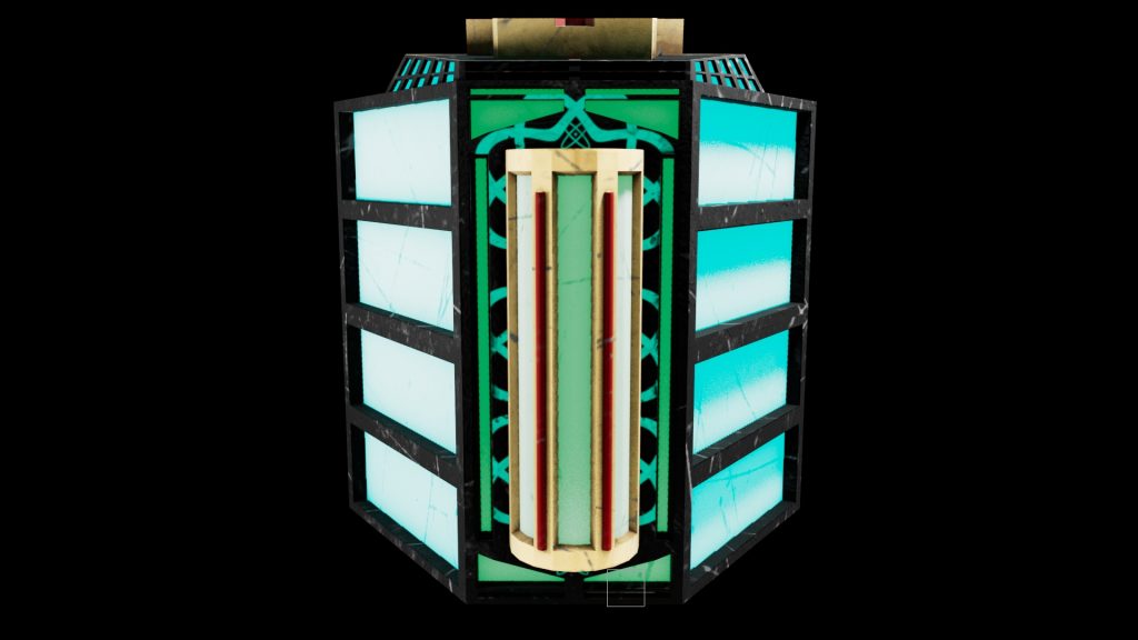
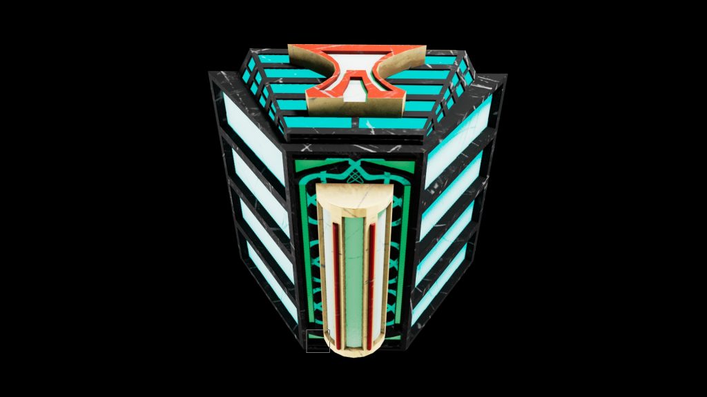
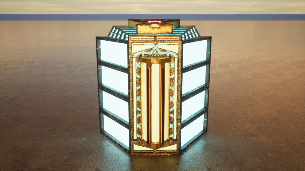
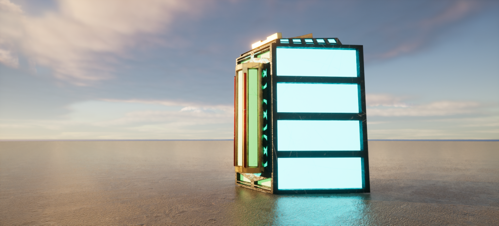
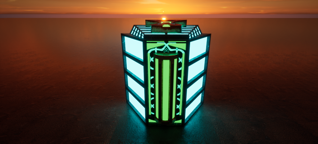
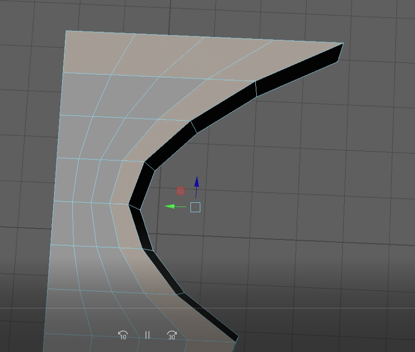
This design ended up being the main inspiration for the final asset design. I really liked the idea of having a power source contained in something more industrial and hardwearing and focus more on the details of the asset. In the end I changed some things during the design process, but this ultimately was the idea that eventually turned out to be my hero asset.
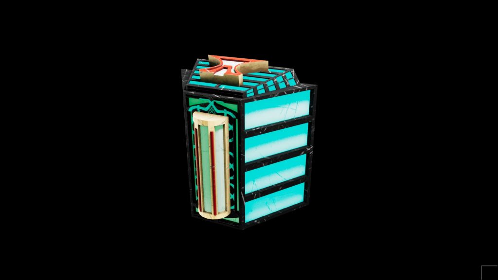
Final Hero Asset design
Modelling and Texturing
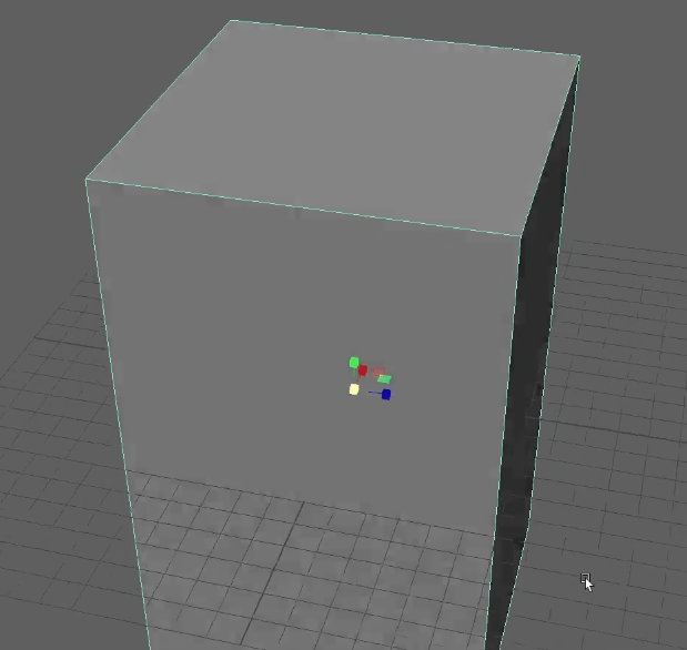
For the beginning part of making the design I simply scaled the main body of my asset to my desired size for me to start working on the actual geometry of the shape.
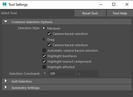
Once I had changed my viewport to ‘Top View’ I could select the vertices I wanted and then scaled them out to make the sides of the main body on an angle. To make sure I selected all the vertices on the back I had to make sure in my tool settings I had ‘Camera-based selection’ turned off. When turned on I was only able to select what my camera could see in a certain viewport.
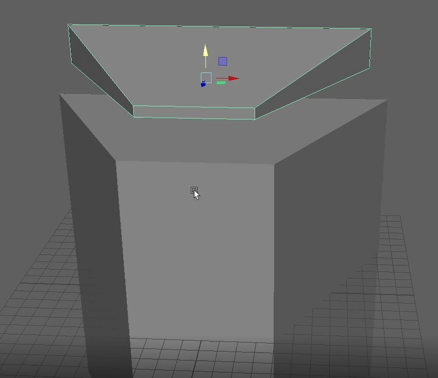
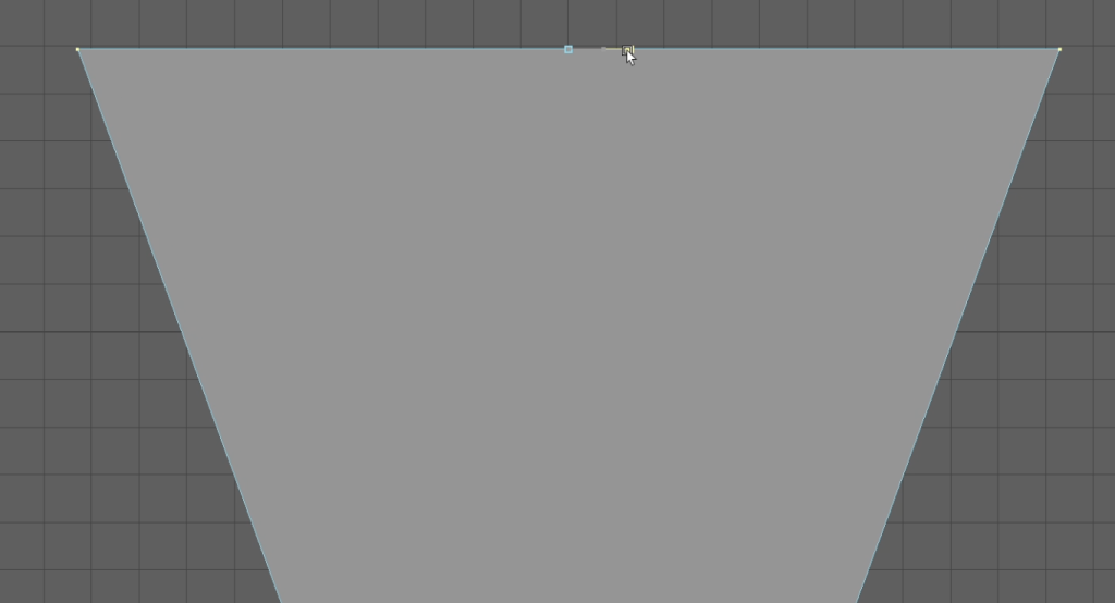
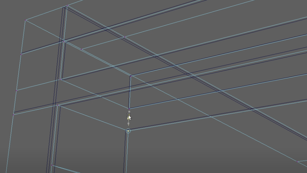
I decided instead of using the extrude tool to make the top which would require me to use far more edge loops in the main body of the asset, I thought I would make a separate top to which I could vert snap onto the top of the main body. Holding ‘V’ and dragging the yellow arrow down I was able to make it perfectly sit on top ready for further detailing. Once again, I was able to grab the 2 top vertices on the front and scale them down as well.
Using edge-loops I was able to divide the object into equal sections allowing me to create some detail in the top piece. This is very helpful in laying out your asset into where you may want to make changes in the shape, adding details, or changing certain geometries of what ever you have selected.
Edge-loops can either be clicked from point to point to create your own desired edge or alternatively I can press ‘Ctrl’ with ‘SHIFT’ to get an exact edge loop across the whole object.
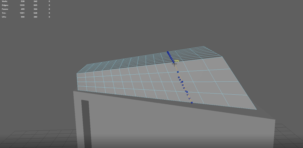
Once I had achieved the required geometry of the top piece, I was able to use the extrude tool to either raise, lower, or move in any angle I desired. By extruding to a negative value and moving the faces backwards a little I was able to create a ‘vent’ effect to which once desired textures and materials are placed it will really come to life.
Also, in the extrude tool there is the option to offset the edge of the extrude by a desired value. That can be utilised with the depth to create a nice angle but that was not required for this piece.
For making the top symbol I found to get perfect symmetry and to save time its easier to delete one half of the object and simply just work on the other half then I can mirror the object across later and merge the vertices to make the perfect symmetry. This also works with UVs with I will explain later.
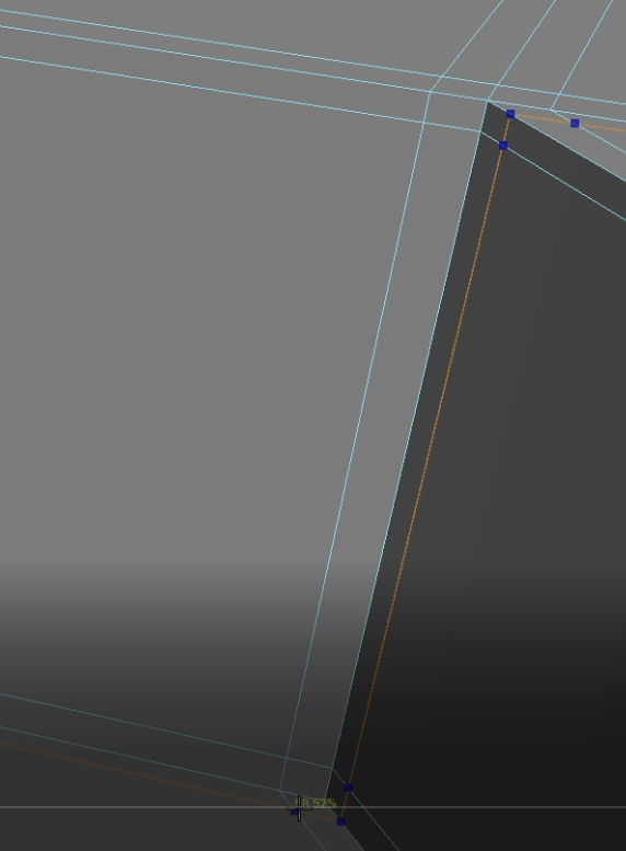
Using edge loops next to the edges, I can create a 3-point contact on all the edges I want to define within my asset. This means when I press ‘3’ on the keyboard to enter smooth mode my edges will remain how I want them. Obviously, no edge in real-life has a perfect edge that is why we must use edge loops to get it as accurate as we desire for the asset.
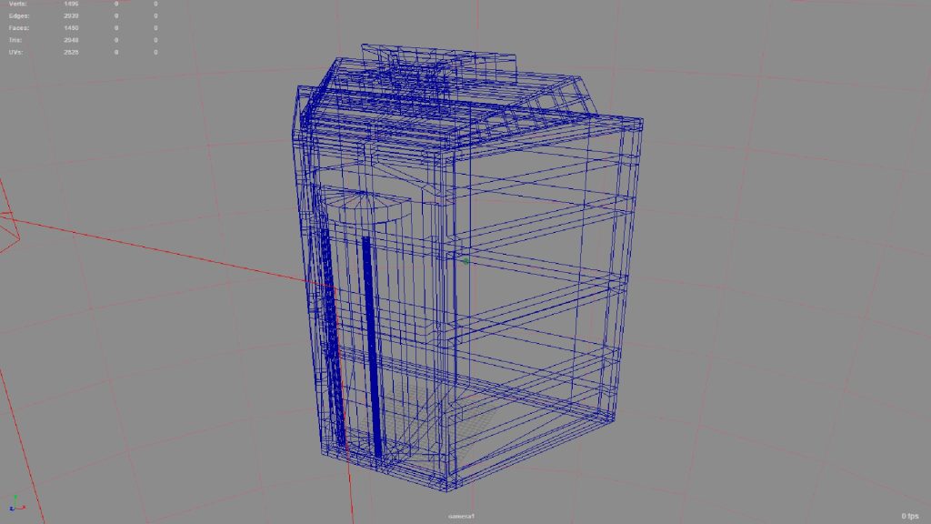
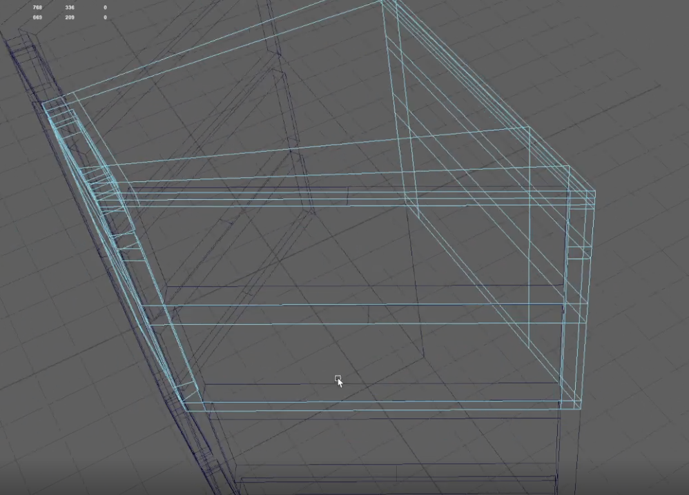
Making the low poly model was a challenge which took a few times to get the hang of but in the end, it needed to be perfect to work with the UV layout. At first, I was deleting edges from the object trying to create less faces but then in the UV it wouldn’t unfold or layout my UV shell, so I had to go back and after some work I realised that less is more. I can map out where I need each individual edge, then I can vert snap the vertices in the right places and extrude the edges I needed to and vert snap again which made for a perfect low poly asset.
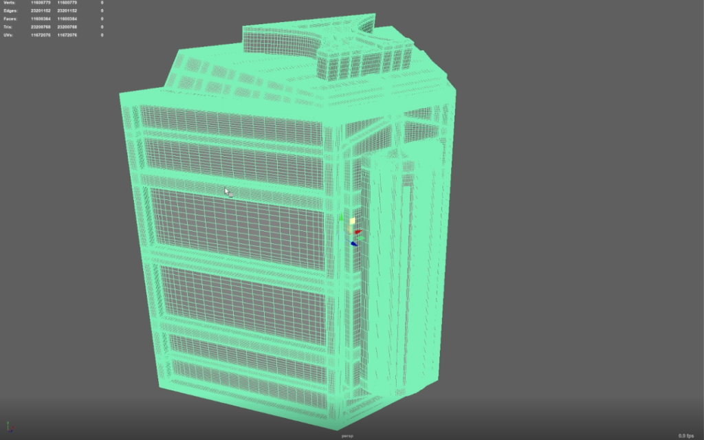
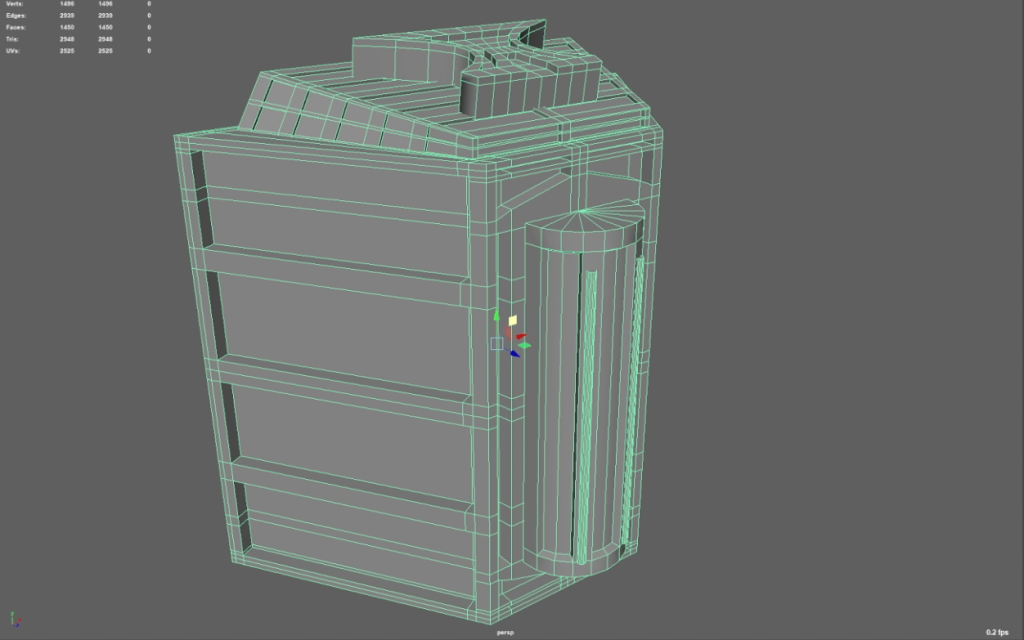
Low poly model vs high poly model.
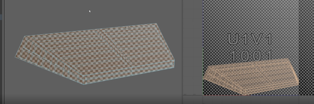
As you can see in the top left of the screenshots, the low poly model has 1496 verts, 1450 faces, and 2948 tris. Compared to the high poly which has a ridiculous amount more. Probably too many to mention. But this allows us to bake the higher detailed poly into Adobe: Substance Painter using the low poly model at first to render in.
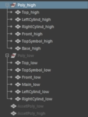
Whilst going through working on this project it was always important to have good file organisation, so the software is capable of understanding what I am trying to achieve when baking the high poly model. Each part of the asset is named the same with the only difference is me telling Maya and Adobe whether it’s a low poly or high poly model.
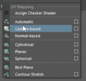
Making the UVs was a huge learning curve but actually quite an enjoyable and satisfying experience. The first step was to open the UV Editor, from there I selected the object I wanted to make the UV for and selected ‘Camera-based’ which would show me the UVs of that object as one object as the main camera was seeing them.
As can be seen from the screenshot, when I do a camera-based UV it will lay the UVs perfectly on the object from the cameras angle but everything else will be skewed and not laid out very well so the first step is to cut the edges.
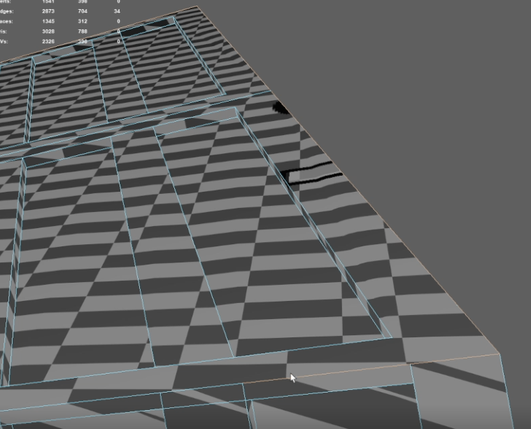
Once I’m back in perspective view, I can go along any seems that need to be cut in order to make the perfect UV shell for me to unfold and layout. I simply figure this out as if I were to unfold a box, if I needed to lay out the object flat, which edges would I have to cut? So that once unfolded, would lay out perfectly flat to the ground. I had a few errors at first as I was trying to cut edges out of the object for the low poly but then the object wouldn’t unfold correctly. Hence why less is more. Don’t overdo it otherwise the UV wont work.
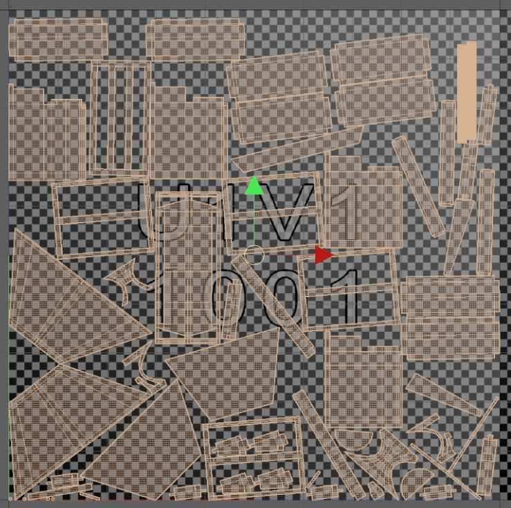
I had to do this for every low poly object that was in my outliner until I had the perfect UV layout ready for Substance Painter. Some things were trial and error as I found its better to straighten the UV shells, but as for some of the UV shells its more beneficial to just unfold so the UV doesn’t skew.
Finally, the finished asset was ready to be imported into Substance Painter for baking and all the fun stuff!
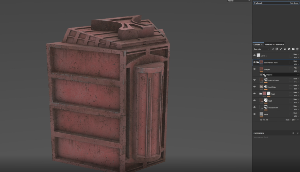
At first the main goal was to get the perfect base layer for my hero asset. This wasn’t necessarily going to be the end colour as I had a lot of playing around with textures to see what type of final look I was going for. I chose a nice steel-worn red, but this was mainly for the textures I received in this smart material. It gave some really bump textures to the metal which I could then start applying to the asset.
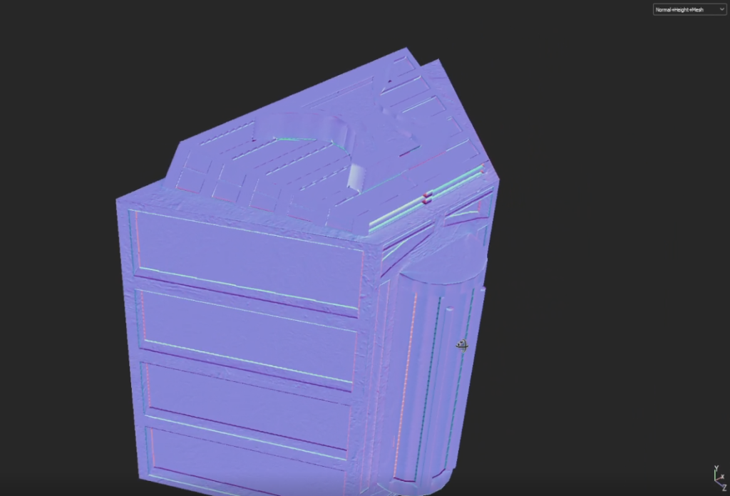
Looking at the normal-mesh map to see the textures and if I needed to add anymore.
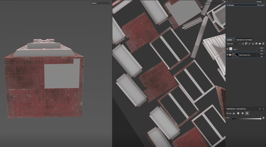
I found the best and easiest way to paint on Substance Painter was with the polygon fill tool which when in the UV viewing mode, I could easily select whole UV shells or just certain faces to make sure no mistakes were made. I was able to do this through the use of a black mask to make sure I only filled where I wanted it.
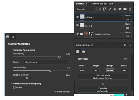
Making the emissive glow in Substance Painter was fun and really allowed me to experiment with what I was trying to ultimately achieve in this asset. I was able to use the same technique by using a black mask and then polygon filling the desired areas. Having the option to play around with the emissive intensity was a great way of seeing how far I wanted to push the object into the night!
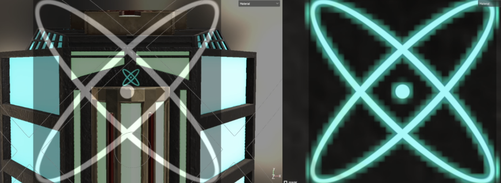
I was also able to utilise the stencil to create some really funky, sci-fi designs that I was also able to make emissive for extra effect.
Once I had the perfect colour to the asset, I added a few more textures such as dirt and scratches to make it look like it wasn’t perfect and had some wear and tear.
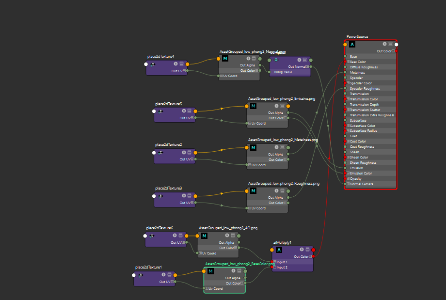
Once all finished in substance painter and I had exported my textures it was time to link them all up in MAYA with ‘Hypershade’ by connecting the nodes to the correct ports to make the asset come to life in MAYA. I however did encounter an issue with the emissive glow not being as strong as I wanted in MAYA but seems to not be a problem in Unreal Engine 5. Something I am still looking into, maybe emission nodes are incorrect or need another port. I’m sure I will figure it out and I will update soon.
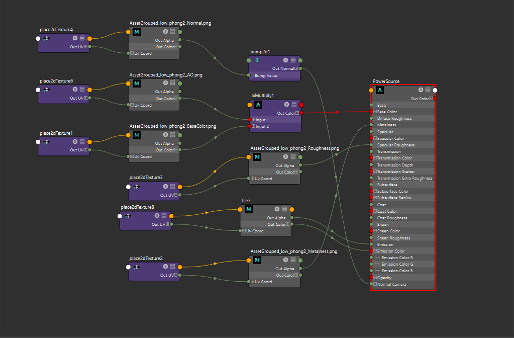
Scratch that. I fixed it.
Lighting
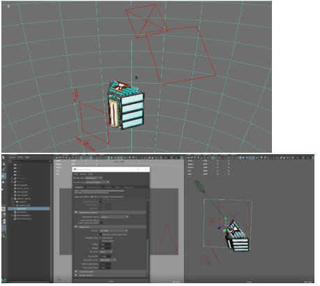
For the lighting I did a simple 3-point lighting set up with one main light and 2 separate lights to the side all at different strengths to give a more realistic look and to be really able to see the texture and details. With the use of planes to light block certain areas I was able to get some interesting effects in the renders.
Link to location and theme
For this assignment it was tricky to be able to incorporate the sub-theme of recycling centre as there hasn’t been much done on it in the past so it made me work a bit harder to find an asset design I could work with and what would work in the environment. In the end, I think the idea is really cool, maybe some imagination is needed into the sub-theme side of it but ultimately, I think it gets across what I’m trying to portray.
Beauty shots and renders