THE TASK
My challenge this week is to use the lessons learned from my lecture on Perspective and Composition to create an interesting environment design. It should include a visible Foreground, midground and background to guide the eyes of the viewer.
MY IDEAS/INSPIRATION
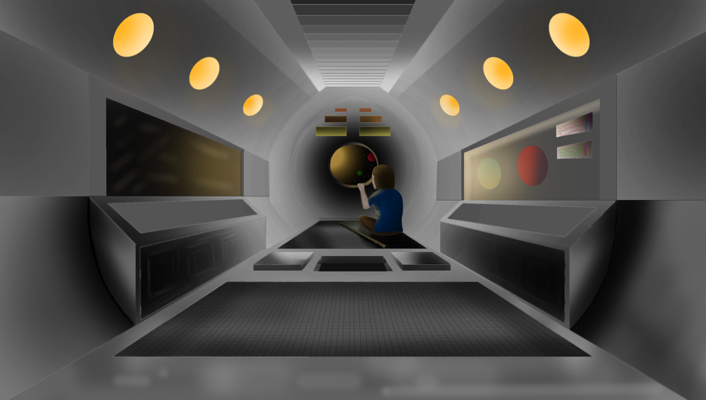
My main idea for this one was to create a space capsule in which a lone adventurer is looking out a port hole style window into the galaxy ahead. My inspiration once again came from my love of Sci-Fi and space in general being that its unknown so therefor it has no limits. The character is basic and doesn’t have much story other than he has his staff and is on an adventure exploring the galaxy! Could be trying to return home or find new ones, who knows?
TECHNIQUES
For this project I found a nice little trick of being able to use the brush whilst keeping hold of CTRL I could then click another location and it would draw a straight line from one to the other. This was a huge help in being able to draw my original perspective lines to get a good amount of depth to the drawing. For the majority part I used the fill bucket tool to get as much of the colour in there as possible and then later adding in what detail I could with the brush tool. For the floor I created a series of chequered lines as a box then warped the image to fit the floor and it worked really nicely. Using a soft brush using the right light and opacity I was nicely able to show the light being reflected off the metal on the floor from the internal and external lighting.
SUMMARY
I was very happy with the outcome however a few mistakes throughout and towards the end cost me some image quality. Firstly, I shouldn’t of used the fill bucket as there would be small pixels in the linework that wouldn’t fill. This left a weird edge to some of the lines so in future I would rather use the brush tool and paint a layer being the lines so I would keep that crisp edge with no pixels in between. Lastly, towards the end I’ve added too much shadow into the centre of the picture when I feel like it could of really benefitted being a bit brighter to draw the attention a bit more. Overall super happy with the outcome and it just inspires me with more ideas!